News/Blog
Let your true colours shine through
Colour has always been one of the easiest ways to update your home to suit the latest design trends.
While we’ve seen millennial pink, navy blues, tropical green and metallics like brass and copper dominate the world of interior design colour trends in recent years, it’s time to get ready to welcome the next big colour tipped to take over in 2018—Ultra Violet.
Each year designers around the globe eagerly anticipate the announcement of the Pantone Colour of the Year which provides direction on the colour most likely to show up in everything from interiors and fashion, to corporate branding, and in 2018, the Pantone prediction pointed to Ultra Violet as the colour that’s set to take the design world by storm.
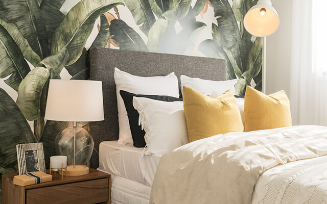
While the colour has a wide range of applications, when it comes to home décor, the team at Pantone endorse the colour for its ability to transform a room into one of extraordinary self-expression, or conversely, tone down a room with subdued, modern pairings. Adding spice and brightness, the colour can make a statement in any space whether you’re going for tradition, elegance or unexpected boldness.
How to use the colour
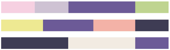
If you want to stay at the forefront of cutting edge design trends and have a go at incorporating a touch of Ultra Violet into your home, Pantone have made it easy by providing the following eight suggested colour palletes and harmonies which demonstrate how to use the colour and the ideal proportions and measures to make the colour scheme work best.
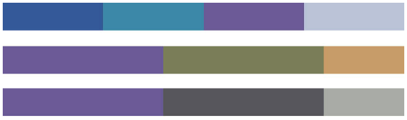
Purple Haze 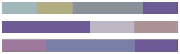
Embodying calmness, a palette of hazy and smoky hues effortlessly commingle to create subtle blends and harmonies that are both timeless and time-honoured.
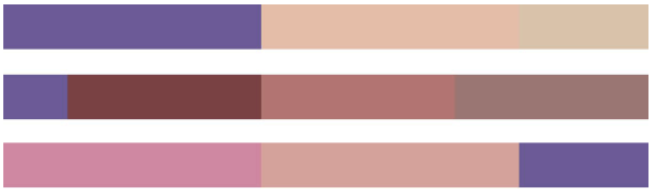
Kindred Spirits
 Sitting side by side on the colour wheel, this palette of like-minded hues with their spirited good humor and playful exuberance makes for easy and engaging colour mixes.
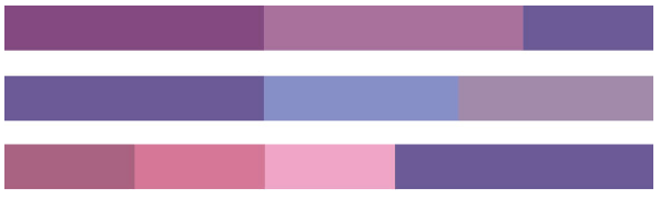
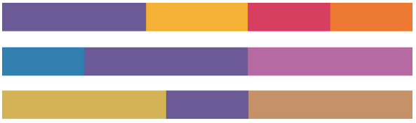
Drama Queen
An unusual combination of show-stopping saturated colour with rich and elegant earth tones creates an adventurous mood full of excitement and drama.
Intrigue
Invoking a sense of mystery, a palette of nature’s blues and greens, combined with the unconventional ultra violet and silver and pale gold metallic, exudes a quiet strength.
Quietude
Soft and warm, a subtle palette of natural and organic shades accented by a Frosted Almond metallic evokes reassurance and conveys a sense of calm and quiet.
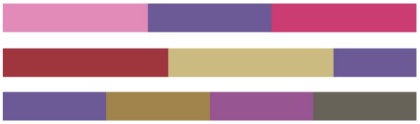
Attitude
 Exploding with zest and energy, this palette of pure, unadulterated colour which screams “look at me” comes together to create a bold statement with feelings of excitement and high voltage effects.
Desert Sunset
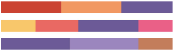 Emulating a desert sunset, this is a dramatic palette of brilliantly heightened warm shades that radiate resplendently across the early evening sky.
Floral Fantasies
Inspired by the colours we see in our surroundings, a combination of soft and sweet pastels with an enchanting ultra violet and deep, dark navy conjures up a summer garden in full bloom.
Visit the Pantone colour of the year website for individual Pantone colour details.
How to incorporate it into your home
The biggest risk when following the latest trend is being stuck with it when it goes out of fashion—and like most trends, it almost certainly will at some point.
To help you incorporate a touch of Ultra Violet into your home while ensuring it can be easily updated as styles and trends continue to evolve, here are some ideas that can help you along the way:
- Soft furnishings: Soft furnishings are quite possibly the easiest way to maintain and update the look of your home regularly. Think cushions, throws, rugs or bedspreads. They’re relatively affordable and are easy to update as styles change.
- Artwork: While it may not be a good idea to purchase an expensive piece of art to match the fad or trend of the time, if it’s a timeless piece that you absolutely love, go for it! However, if you’re looking for a more affordable alternative, opt for framed prints in black, white or neutral coloured frames—you’ll be able to keep the frames and simply update the prints as trends change.
- Decorative pieces: Whether you choose to invest in a few vases, candles, photo frames or ceramics, display arrangements of items from your chosen colour palette on sideboards, mantles and tables throughout the home to give it an instant update.
- Feature walls: If you want to make a statement, rather than replacing your kitchen cabinetry with something in the latest bold and bright colour, a painted feature wall is a far safer bet. It’ll give you the same level of impact, but is far easier (and cheaper) to repaint down the track once you tire of the look.
Trends will continue to come and go, so the most important thing when making any interior design updates is that YOU like the style.
When you build a new home with Dennis Family Homes, you’ll be able to choose all your favourite colours, fittings and fixtures from an extensive range of contemporary colour schemes and designs during your personal colour consultation.
Visit a Dennis Display Centre to get a taste of some of the possibilities when you build with the Dennis Family.
Your trusted Melbourne Home Builder – Dennis Family Homes – A Family Building Homes for Families